• Work
  • About
  • Contact
  • What's new?
Finbar Hussey
  • Work
  • About
  • Contact
  • What's new?

Design Challenge #2 - Prospero Industries

This week was another logo challenge, I really enjoy doing logos and this was no exception. Interesting brief where the chief application was on the side of a vehicle. In future challenges we started doing more mockups so that’s something to look forward to! The brief for this was:

Prospero Industries

Company Description:

We make tutoring services for learning finance. We stand out because of our new technologies. Our target audience is people with a middle-class income. We want to convey a sense of eagerness, while at the same time being inexpensive.

Job Description:

You must create a logo using the information given in this brief. They would prefer a pictorial mark that uses the color white. The logo will be printed on the side of vehicles. Take into account the company's values and preferences, and make sure it will work for the planned use-cases.


My submission:

This, for me, was one of those briefs where I instantly had a few good ideas, designed them all out then realised I'd misread the brief and had to start over 😂

As the use case for this was to on the side of vehicles I decided to keep the layout horizontal and the graphic fairly simple. I went with a deep green as a professional "growth" colour. The graphic itself with the upward swoops was to imply upward motion "outside of the box" and I custom drew the Prospero font so I could connect the S up. 

Overall I'm pretty happy with this one, my only major criticism is that outside of the context of a website or brochure I'm not confident it fully communicates education.

Main Logo

Main Logo

Alternative colouring

Alternative colouring

Black and white

Black and white

Friday 07.03.20
Posted by Finbar Hussey
 

Design Challenge #1 - Walnut and Wax

For the last few weeks during lockdown I decided to issue a challenge at work, the designers would get a weekly design brief and every Friday submit our work to a submission email thread so we could check out each others work. It’s been a really fun process so far and I’ve learned a lot from all the incredible designers I work with. So, I wanted to submit my work each week to my blog as well and track my design progress here.

The first week was a logo design:

Company name
Walnut and Wax

Description
Walnut and Wax is a manufacturer of fine mid-century modern furniture with a contemporary twist. Think of them as Eames if they were founded during the era of Instagram and Pinterest.W&W wants a logo that feels a part of the mid century period yet modern and friendly to the app shopping demographic they currently aim to attract. Going overly literal and including a piece of furniture in the logo is not advised.

My Submission:

I wanted to do a monogram for this, it always looks stylish and I was able to lightly work with two W’s into a sort of table and chair.

I wanted to do a monogram for this, it always looks stylish and I was able to lightly work with two W’s into a sort of table and chair.

Colour swap version

Colour swap version

And here are the alternative colour schemes

And here are the alternative colour schemes

Friday 06.26.20
Posted by Finbar Hussey
 

Weekly Inspo - Marina Amaral

Having recently started learning to recolour old photographs I had to plug the artist that inspired me to get started - Marina Amaral. She is a Brazilian colorist who specializes in adding color to black and white photographs using Photoshop through a process of careful historical research to determine the colors of each object pictured.

It’s so incredible to see old photography brought back to life with the addition of colour, it draws attention to details in the shots that black and white just can’t do. It’s like these people who seem so distant in black and white feel like they could be here today.

Her most recent project Faces of Auschwitz is particularly worth your attention if this interests you at all. She works with the people at the Auschwitz Memorial and Museum to recolour the photographs of victims of the holocaust who were murdered in the Auschwitz concentration camp. It’s such an important project to preserve the memory of these people and I encourage everyone to go read their stories on the site.

Here’s a video of some of Marina’s work for an idea of what recolouring looks like!

tags: weekly inspo, inspo, inspiration, photography, photoshop, history
categories: Weekly Inspo
Monday 02.11.19
Posted by Finbar Hussey
 

Weekly Inspo - To This Day

To this day is an amazing animation collaboration with poet Shane Koyczan. A number of animators from all over the world were asked to put together a few seconds of animation in any style they wanted to represent a few lines of the poem. The results speak for themselves!

I'm really taken with how the mash of different styles in this piece really feed into the theme in the poem about individual and shared experience. Just goes to show what being willing to let creatives run with their ideas can accomplish!

Incidentally, this one always gets me right in the emotions 🤘

tags: inspo, poetry, inspiration, animation, design
categories: Weekly Inspo
Saturday 08.18.18
Posted by Finbar Hussey
 

Weekly Inspo - Refactoring UI

This week I'm all about UI design and the excellent series Refactoring UI by Steve Schoger.

This is an awesome youtube series where Schoger takes you through his full thought process on redesigning UI for landing pages, input forms and more. It's only got a few episodes out but I'm completely addicted! You can also check out their website here for other design tips and tricks.

I'm off to go tinker with some websites 🤘

Thursday 08.09.18
Posted by Finbar Hussey
 

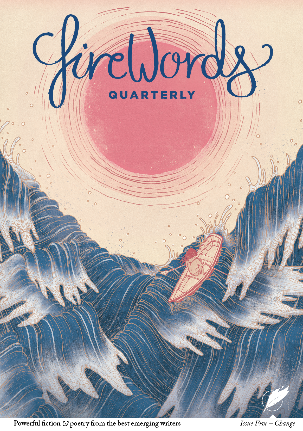
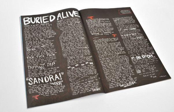
Weekly Inspo - Firewords

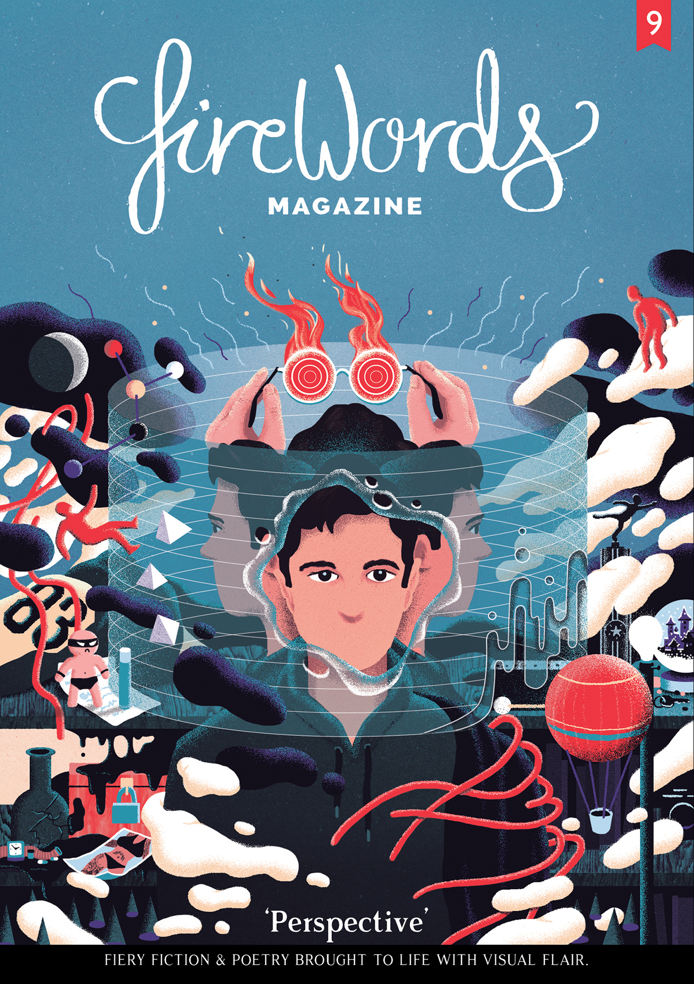
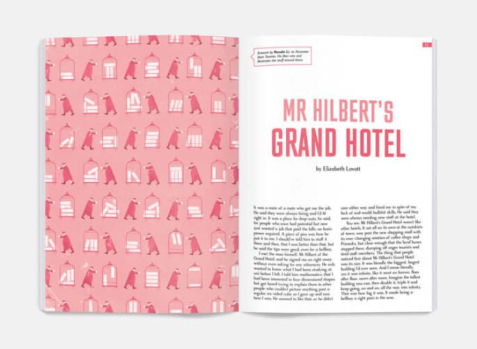
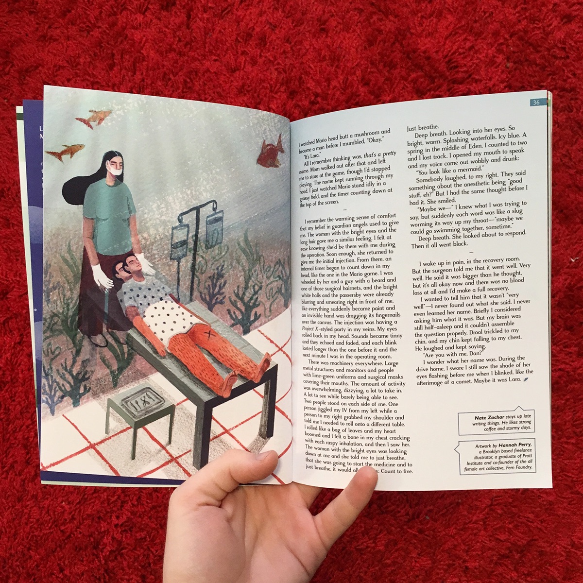
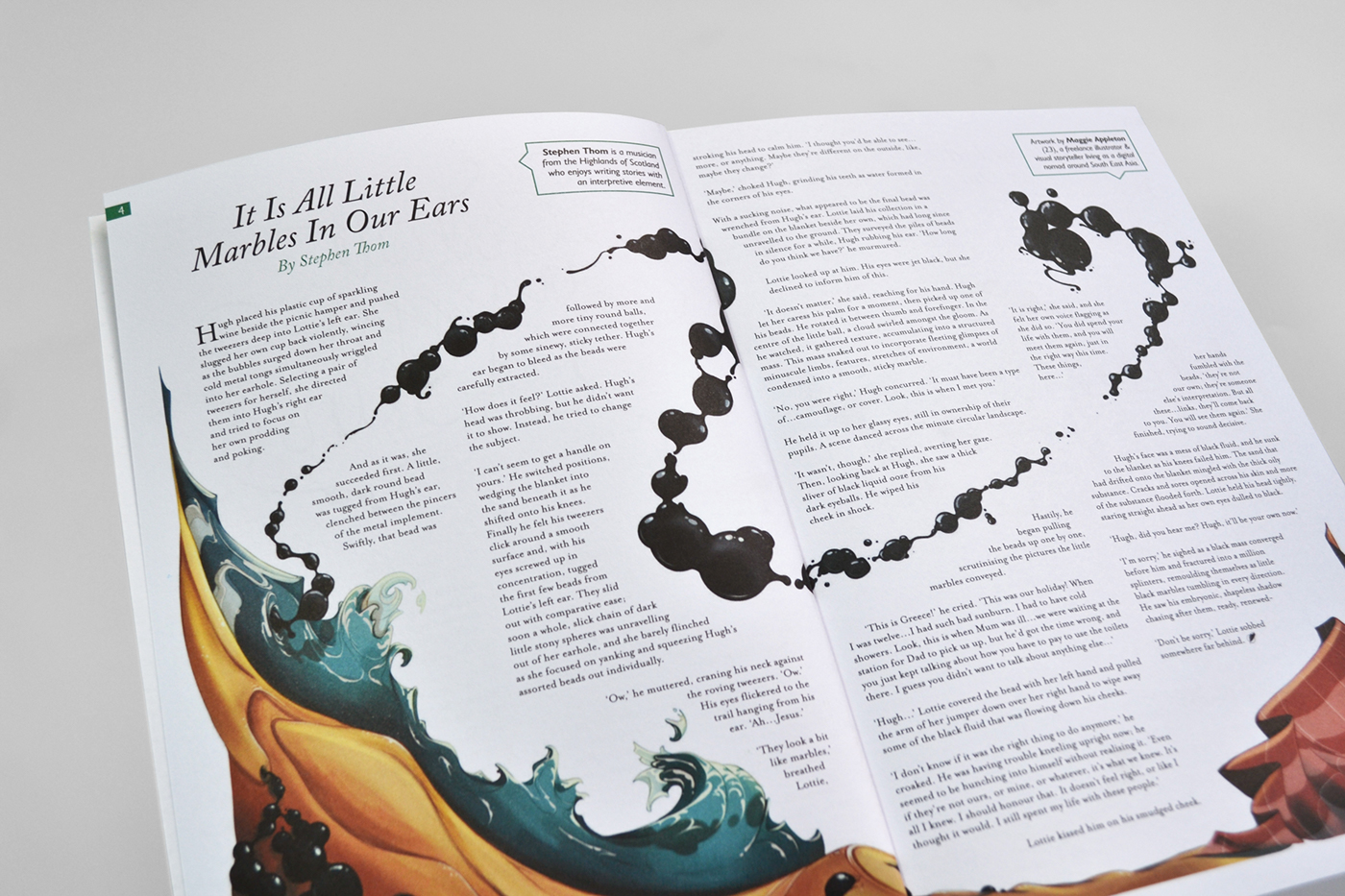
Back again with what inspired me this week, and this week have I got a treat! I've recently started designing for a zine a friend does (check it out here) and he put me on to the incredible Firewords (check them out here). They are a creative writing publication that do some of the nicest cover and layout work I've seen in a writing magazine. I'm particularly fond of how they tie the form of each spread to the subject matter of the story inside. If you have a few bob to spare I'd recommend picking one up just to see how nice they are! Also keep an eye on Bombinate for their upcoming issues. 🤘

fd3e8860111097.5a3c0fcae0152.jpg
iss8-hotel-spread.jpg
c6892b61802033.5a7a603e8272d.jpg
0891a027957993.5636dcf59ef0c.jpg
68e978c21ac3ed179ec62685c5e7f790.png
buried-1000-e1404156230867.jpg
Thursday 07.26.18
Posted by Finbar Hussey
 

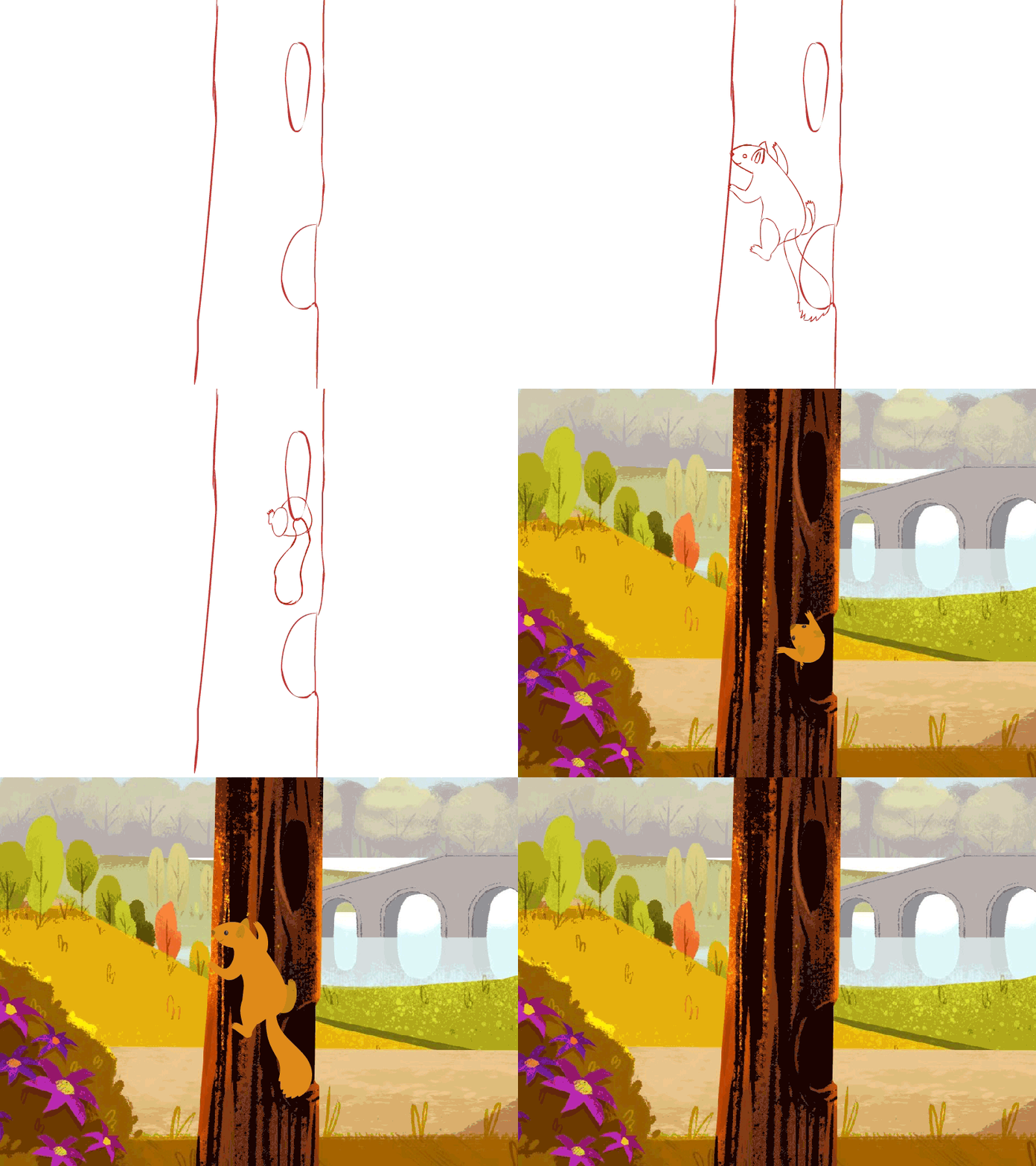
Weekly Inspo - Icons by Ramotion

Check out these insanely cool icons by the guys over at Ramotion, they are a seriously talented UI/UX studio, so please go check out their Website, Dribbble and Instagram for more inspiration!

🤘

travel_river_animation_ramotion.gif
castle-illustration-animation-process-ramotion.gif
travel_camping_animation.gif
travel_mountains_animation_ramotion.gif
travel-island-illustration-animated-process-ramotion.gif
tags: animation, design, gifs, loops, illustration, inspiration
categories: Weekly Inspo
Thursday 07.19.18
Posted by Finbar Hussey
 

Weekly Inspo - Samantha Jones Loops

I love me some looping animations, and Samantha Jones produces some fantastic stuff! Check out her Dribbble, Website and Tumblr for some more animated goodness. 🤘

2796df79-12af-4021-b0d7-838e7996e35d_rw_1200.gif
4ee7f9d4-57d6-4318-82cc-62af742153dc_rw_1200.gif
3ec6106c-1b5b-4ac2-ad90-cae78ea11a32_rw_600.gif
tumblr_o8gjfsjPYv1ras6wqo1_500.gif
tags: inspo, inspiration, loops, animation, design
categories: Weekly Inspo
Monday 07.09.18
Posted by Finbar Hussey
 

Hello world 👋

Holy hell I cannot believe I finally got this site off the ground! 

I'm going to try to keep this blog updated with stuff in design I'm looking at and maybe some thoughts about films or animations I really liked. In the mean time please enjoy this gif of my head.

Friday 07.06.18
Posted by Finbar Hussey
 

powered by caffeine